Teams are starting to leak their jersey designs for the 2015 season - and yes, teams still need to have uniform jerseys for the 2015 season. So, we figured why not look to the past and dig up some inspiration for teams that are in need of a push. After all, we're midway between the draft and the first preseason tournament; this is the last time things are going to be quiet for awhile! We've repurposed the
power rankings machine to handle a task for more complex than ranking teams or players - one in which there are no numbers to quantify or compare. Without further ado, the following are the ten best jerseys ever worn in WSEM history.
10. Onanism (2014)
Ambisextrous, Wet, Nose Blow Joe, Flip Dick, Louisville Snuggler... I'm not particularly a fan of NOB (names on back), but when
they're executed with such fantastic style as this it's hard not to smile.
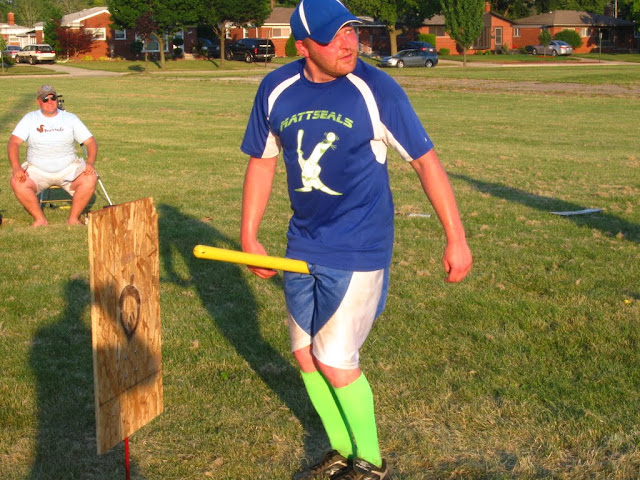
9. Mattseals (2012)
Possibly the best color scheme seen in WSEM history, and featuring one of our most amusing logos. Points lost for the white business wrapping under the arms. Using the bright green as the jersey's main color could still have propelled these higher.
8. Ducks (2013)
Brightening the base color to a kelly green would have made these a top contender. The forest green is too dark alongside the black details, but the logo still puts this one in a good spot on the list. The athletic gold outlined numbers on back add a bold touch.
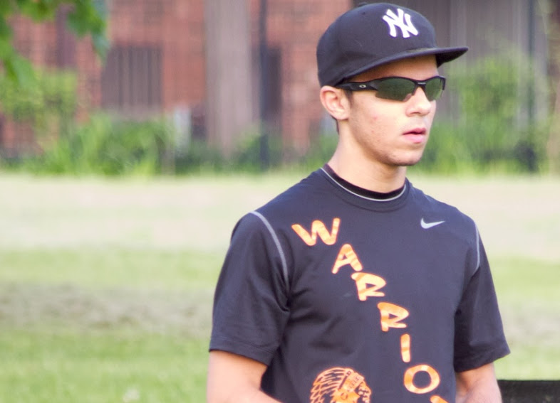
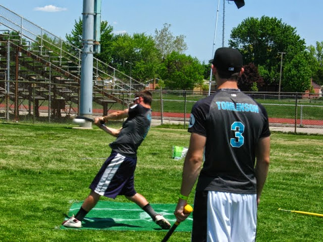
7. Westside Warriors (2011, 2013)
The inaugural winner of a "best look" award in 2011 now sits at #7 overall. That is a good thing. Although the 2014 logo update was great upgrade, the original jersey design with its slanted script is far more unique. That gets you points. The orange numbers also add a lot more character than the white used on its successors.
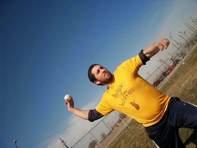
6. Belgian Wiffles (2014)
Ask me if yellow on yellow makes sense, and I'll tell you "no." Show me yellow on yellow, and I'll eat my words. The fronts are a little clunky, incorporating two lines of script and the logo, but Mrs. Swingin' Buttersworth keeps this look very fun. Spin around, and this design just oozes butter: so fitting. Yellow on yellow shouldn't work, at all, but the unconventional results are remarkable.
5. Flying Squirrels (2012, 2014)
You knew the baby blue and brown combo had to crack this list. The home blues with brown print have always seemed a little more unique than the inverse blue-on-brown version. The "bushy" script is classic yet playful all at once, with the squirrel forming the 'S' and acorn dotting the "i". Hands down the best color scheme in sports.
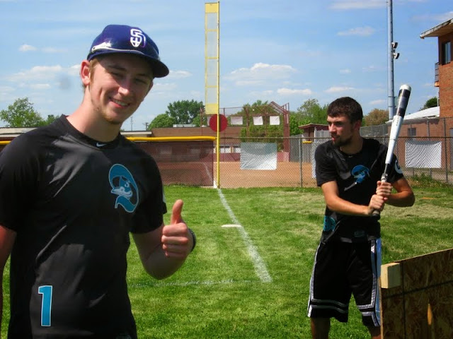
4. Wicked Aces 2012-14
Incorporating the player number into the club logo on front is an awesome feature. Granted, I may be a bit partial to this idea
due to nostalgia. Nonetheless, that coupled with the sleeve patches (Aces primary on right, WSEM logo on left) made this one of the most detailed and creative jerseys back in 2012. The look's aged well, and still gets high marks.
3. El Diablos 2014
Even with anthracite and black being the dominant colors, the teal elements refuse to take a back seat here. Outlined in white, they really pop off the dark base. Logo on the left breast and front-number staggered below opposite: a classic baseball style for a team that is quickly becoming an iconic wiffleball franchise.
2. Campus Commandos (2012)
Sports teams should generally avoid wearing camouflage. That said, when your name is Commandos it's the best look you can put on. Instantly recognizable on the field from any angle, while definitively representing the team name. The 2012 logo emblazoned across the front is also one of WSEM's finest.
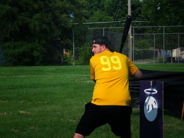
1. Holy Balls (2014)
Logos usually get plugged into a spot on the jersey. A jersey rarely (never?) becomes the team's logo. But that's exactly what happened when the Balls made their 2014 threads a wiffleball: the 8 holes wrapping around the player's chest and back. Creativity in your design concept will get you a lot of points, and concepts don't get much more creative than this. … At least not yet.